King Fisher Colours
Nature is often the best place for colour inspiration and the Vibrant Cyan blue, Punchy orange and crisp white of Britains most glamorous bird the King Fisher certainly inspires. I'm really in love with this colour combination colour as a vibrant earthy terracotta is warming, and much easier to work with than red which can be notoriously difficult to pair without looking garish. Terracotta when paired with navy or punchier royal blues creates a sophisticated and modern look.
Raspberry & Sky
If you’re looking to create a room filled with brightness and perkiness a colour palette of Raspberry pinks and cool blues is a great place to start. Blue and pink are usually associated with Blue for boys and Pink for girls so mixing the two can create a fun mix.
Team a palette of super-charged bright Reds with softer blues for a bold chic look. Sky Blue and Raspberry works particularly well with splashes of Millennial Pink as it helps lift the overall palette and balances out the more punchy colours. The vibrant blue and pink are perfect for creating a cool visual effect contrasting the pale pink walls.
Viridian Ombre
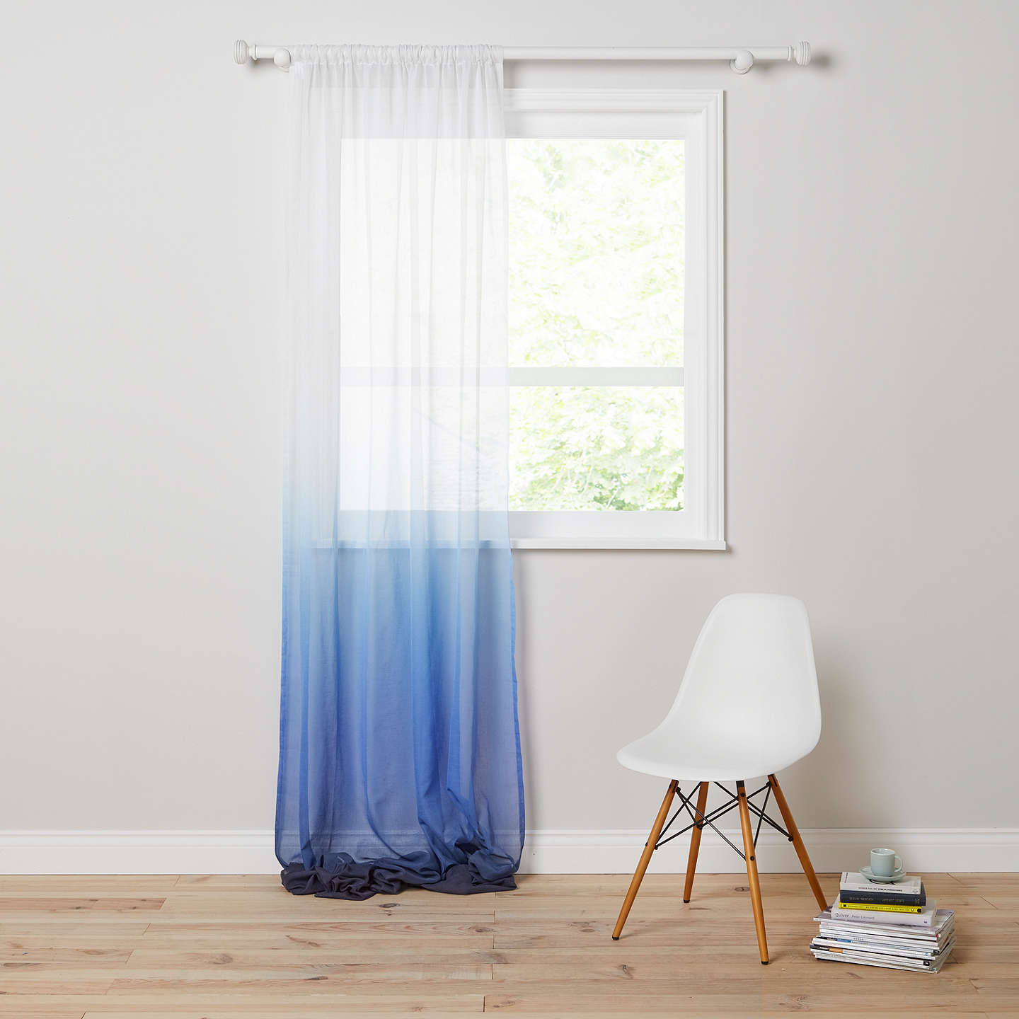
With rich indigos and deep viridians paired with soft whites let your mind trail off to far away destinations when you take interiors inspiration from the beautiful shades of mist rising over the dark misty mountains. The word Ombre originates from the French word ombrer which means to shade, it has since taken on the meaning to define a technique of adding a gradual colour, from light to dark. The beauty of ombre that it embraces the imperfects, there is no right or wrong to ombre as long as the final result is beautiful gradients.
Ombre is the gradual lightening of colours and the uses for ombre in the home today are limitless, from the walls to the smallest accessory. It can be what you wish it to be from charming and simple to eye-catching and in your face. Ombre is a versatile style that can bring an effortless bohemian feel to home décor. For a boho chic look, you can create a look with a ‘dip-dyed’ tie-dye look, mixed with symbols and a feminine charm. Alternatively, by using ombre as a backdrop for modern white furniture it can take on a more sophisticated appearance.
If you want more interiors inspiration check this Sage & Cream Room Inspo post!


I love the blue and orange color scheme. Your blogpost is great inspiration to me and beautiful to look at.
ReplyDeleteThank you for the direct link to matching products. How did you do that?
Cheers from Germany,
Stephanie
Hi Stephanie,
DeleteThanks for the comment! I use a widget from ShopStyle Collective which is free to sign up for :)
Hope this helps,
Gracie x
Your blog has piqued a lot of real interest. I can see why since you have done such a good job of making it interesting. I appreciate your efforts very much. paint for exterior
ReplyDelete